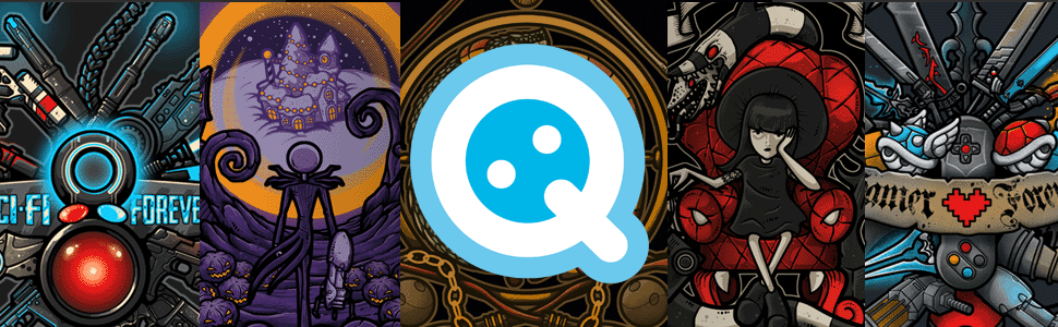
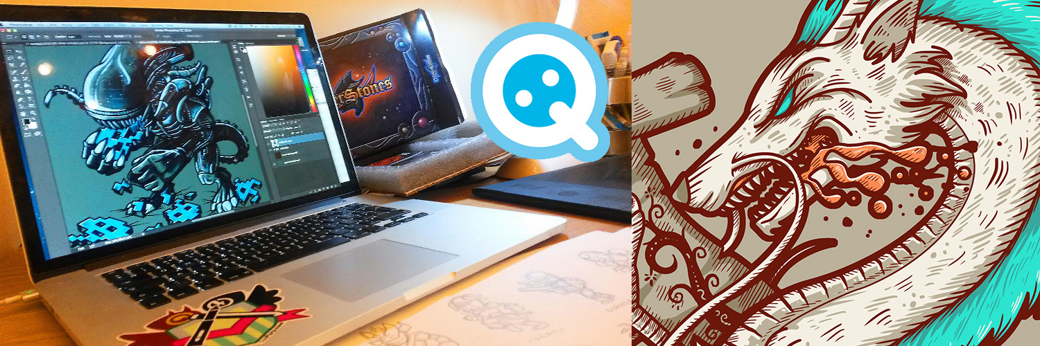
Letter-Q is an Italian-born artist in the UK, whose crisp line work and limited palette combine to create stunning symbols, totems and crests assembled from instantly recognizable elements of your favorite pop-culture films and games. A long-time TeeFury favorite, he’s taken a moment to talk with us about his process and his entry into the world of pop-culture apparel.
TEEFURY: Your designs tend to tell a story through iconic items that inhabit the universe of your inspiration. When building out a totem or crest, where do you start?
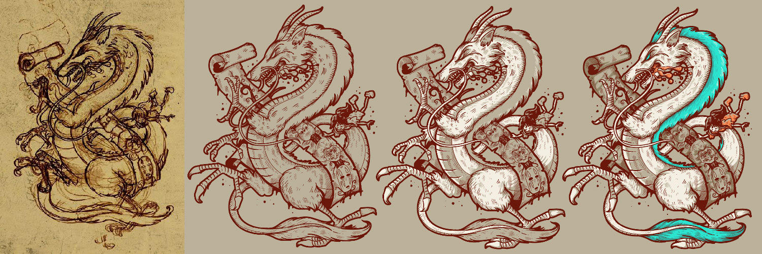
LETTER_Q: If there is an object that is able to tell a whole story in just one shot, that must be a crest. When I choose a theme, I pick the 3-4 elements that best represent it, place them in strategic points, and then build the rest all around them. You can put as many elements as you want, as long as everything remains readable and recognizable, and the whole piece doesn’t look too cluttered.
TF: How has being a gamer translated into your art?
LQ: Video games are a great source of inspiration. There is everything in there. Fictional worlds, background stories, character design, sound effects, music. It is creativity at its finest! Being an artist, the best way to celebrate such a great thing is to constantly take inspiration from it. A good 60% of my whole production has video games references in it.
TF: Where did your deliberate use of color originate?
LQ: Colors are a crucial part in my art (ok, I guess every artist would say so…). I rarely leave something in black and white. A good line work can be pleasant to eyes, but adding colors seems to bring it to life, and a different shade can totally change the mood of a design. That’s why I’m always quite picky when choosing colors. I usually start from one or two main colors which better reflect the piece I’m working on, then I carefully add more tones as the design develops. Also, once the artwork is finished, and I have the whole piece in front of my eyes, one additional tweaking is needed, to adjust shadows and highlights and to make the overall look a bit more consistent. I particularly love this stage: it’s like equalizing you favorite song to make it sound perfect.
TF: Your line work tends to be solid, with a dimensional heft to it. Do you work exclusively digital?
LQ: If colors bring designs to life, a good line work is what translates an idea into an actual piece of artwork. My linework tends to be quite thick indeed, especially the outer stroke, and to give a bit of balance and some dynamics to the design, I use different weight for different parts of it. I like crisp and sharp lines, and using vector softwares is the best way to get this result. My work is mostly digital. I sketch my ideas on paper, but then the rest is made entirely in digital.
TF: How do your Italian heritage and English surroundings influence your work?
LQ: This is a nice question! I think I’ve kept the known taste for aesthetics from my Italian origins, while my english experience (London in particular) gives me the right push every day to try new things, to explore new territories without any fear of going too far. Creativity needs experimentation, and experiments in art are never dangerous!
TF: Which design in your catalogue best represents you as a person? Which are you most proud of?
LQ: This has to be Gamer Forever. It’s a tribute to the gaming world, and to my childhood as a gamer. I’m quite happy about the way it turned out, and it happens to be one of my best seller ever, which is never a bad thing.
TF: What advice do you have for the world at large?
LQ: Keep being creative, do what you love and love what you do.
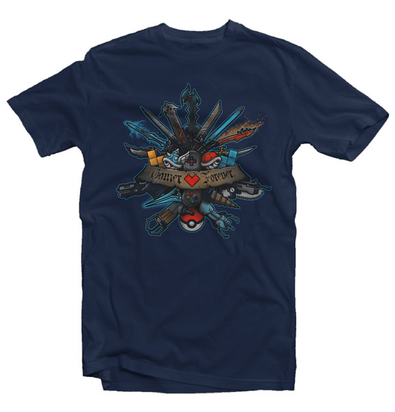
“Gamer Forever” by Letter_Q
You might also like